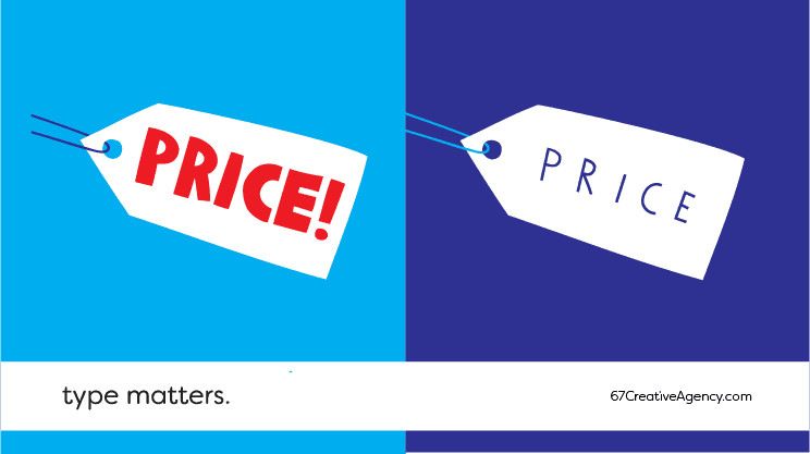
Type Matters

The typeface defines words meaning.
Before you read the rest of this article, TRY THIS EXERCISE:
Identify in the image above which is the cheapest and which one has the highest price.
If you are European or American you probably picked the “FAT” typography as the lowest priced one. This is because you’ve grown used to seeing those fat letters in shop displays and promotional flyers for supermarkets, “screaming”: “– Discounts! Sales! Promotions!”.
In true Pavlovian style, we are animals that learn through habit and repetition and to a certain extent that’s what makes us a community: because we share a countless number of experiences and knowledge. This baggage is stored in our brains and any good designer knows – and uses – that to their advantage.
When designing a poster, for example, the designer has at their disposition thousands of typefaces and will have to pick only one or two. There are sophisticated and elegant fonts, childish and fun, perspective and strict, humanised and spontaneous, technologic, classic… and many others.
In an efficient marketing communication, the fonts chosen are the ones most suited to the message to be spread. Each typeface has its own style and tone and its choice can’t be left to chance. At the same time, its colour, size and spacing can be worked on to emphasise or soften its unique characteristics.
Communication Design is made of small details. The typography choice is just one of them.
If you need help, talk to us. If you are unsure of where to start, please email us at info@67.com or contact us at +351 223 170 101. Find out what we can do for your business.
