Play this video:
Hospital Terra Quente
Healthcare Design.
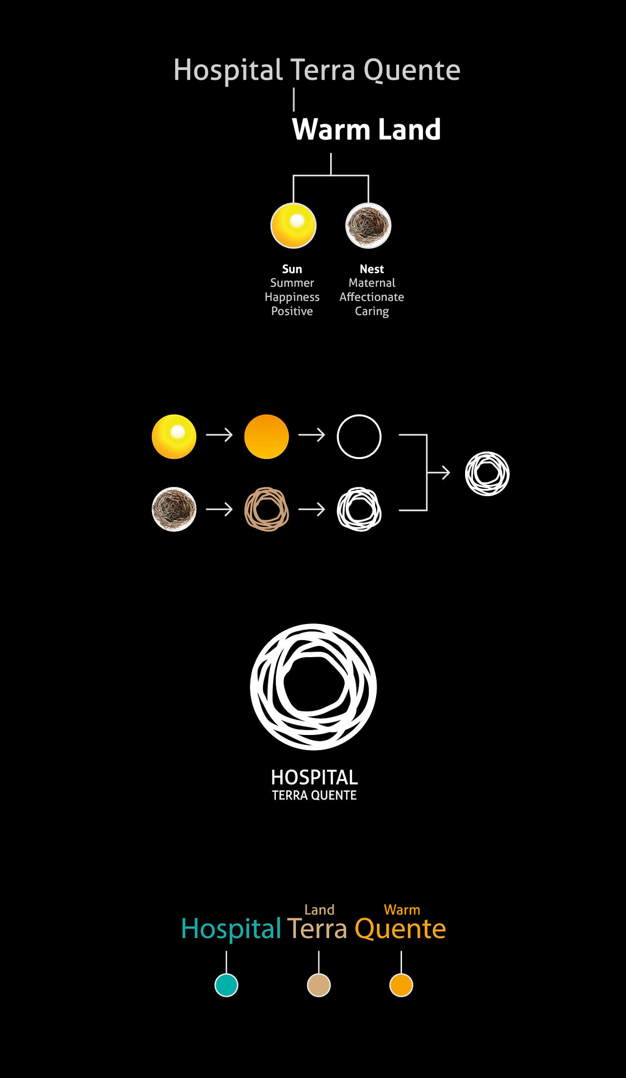
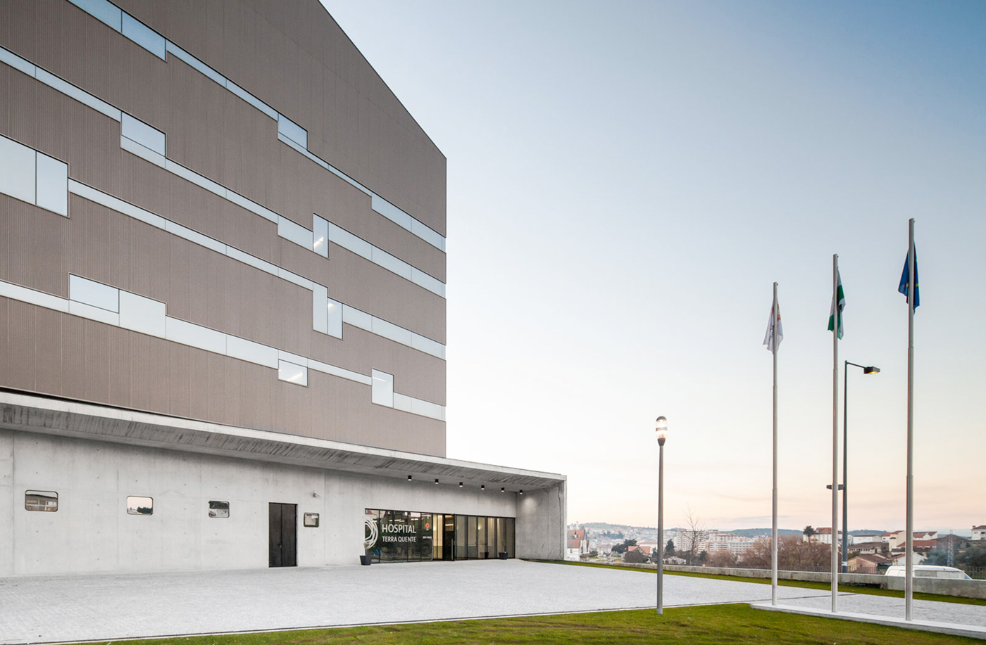
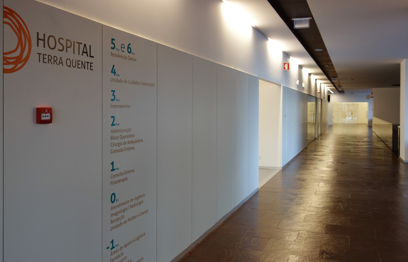
Hospital Terra Quente is a large private hospital situated in a region known as “Terra Quente”, meaning “warm land”.
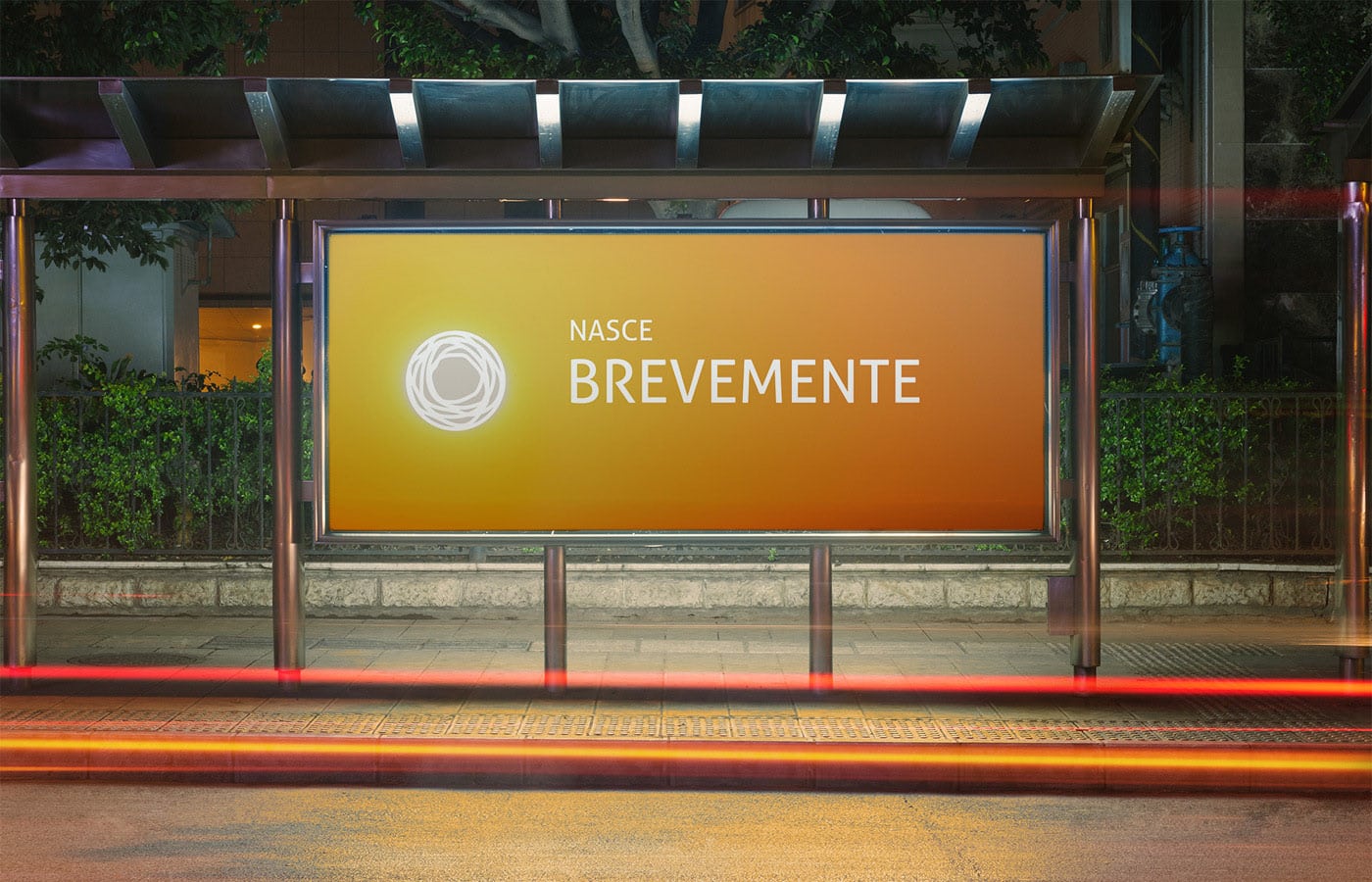
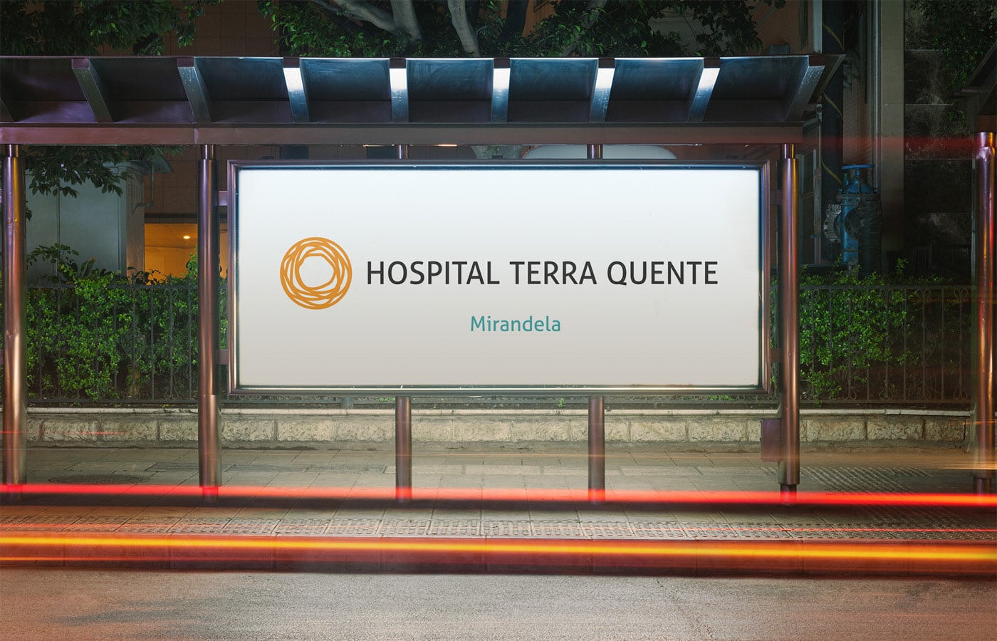
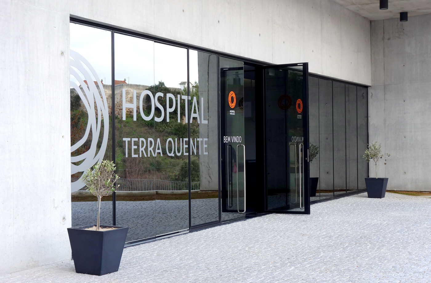
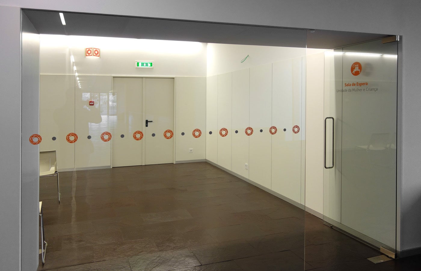
Precisely because of that idea of warmth, we designed a logo with bright colours that conveyed the idea of sunshine through its circular shape.
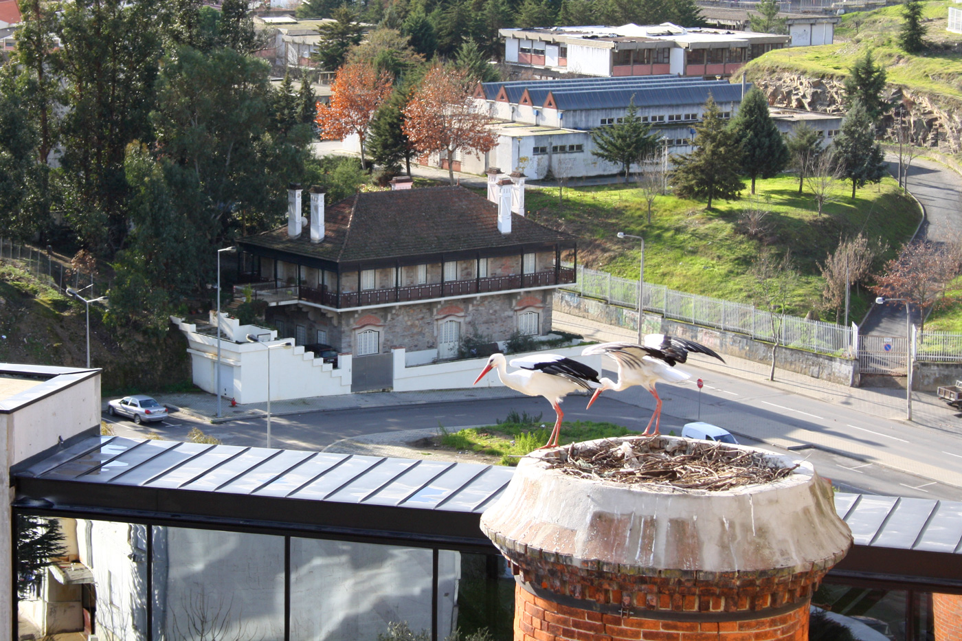
But the story goes deeper. The Hospital was built where an older factory once laid. In that factory’s tallest chimney, there was a large stork nest that became a recognizable part of the landscape.
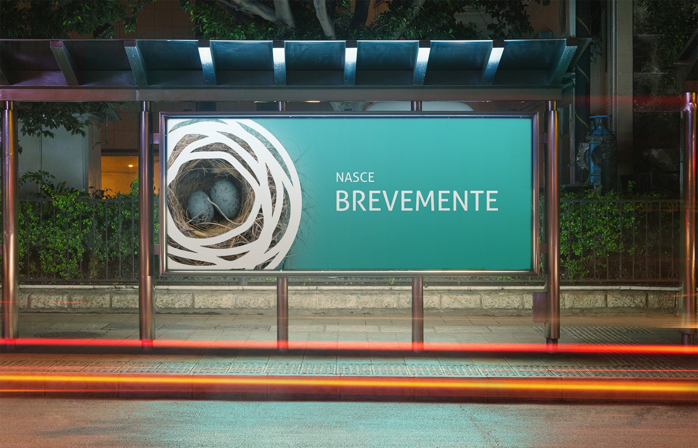
The chimney and its nest were kept in the architecture of the current hospital, and because of its uniqueness we used it as further inspiration for the logo design, merging the image of a nest with that of the sun and warmth.
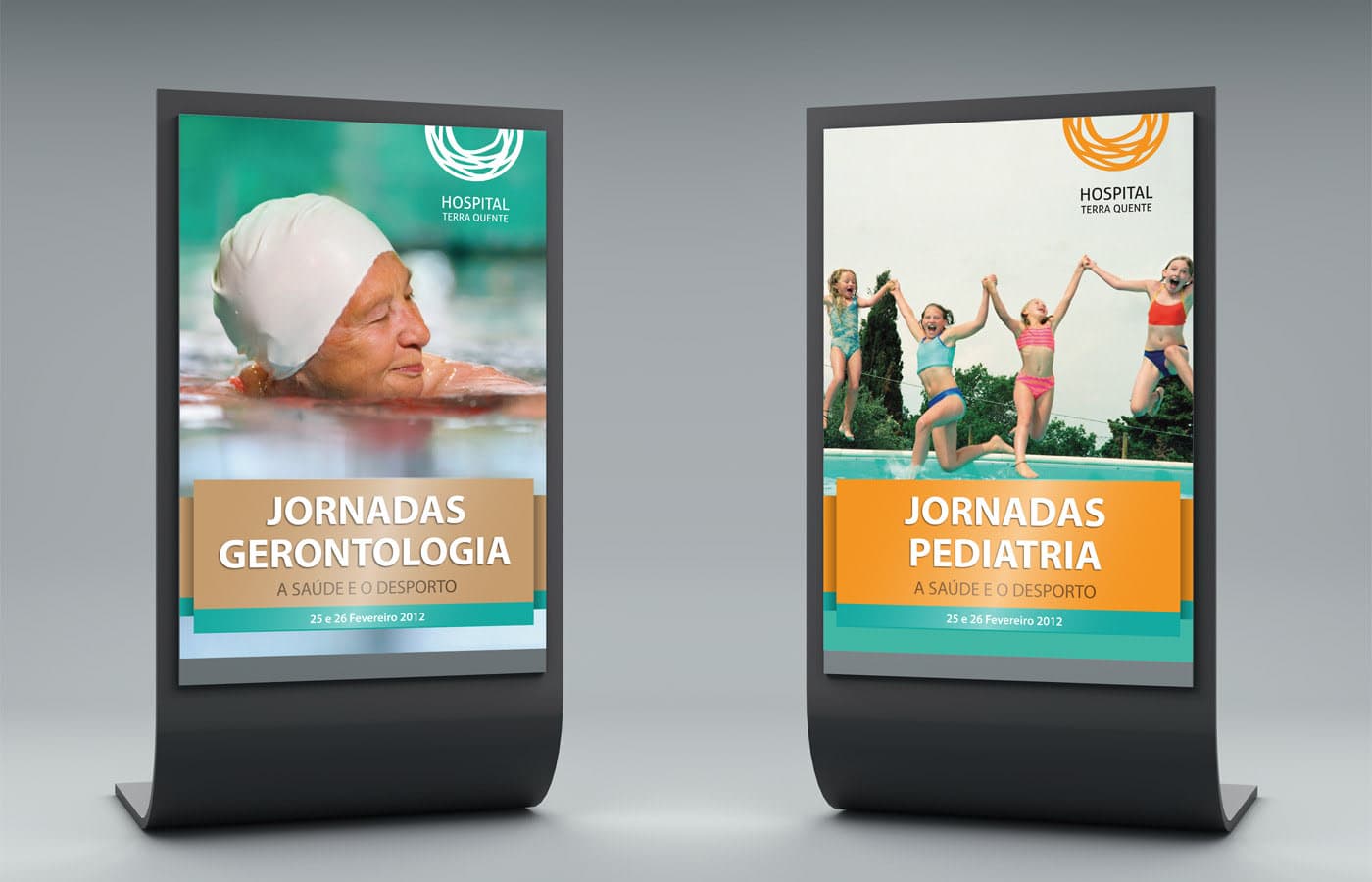
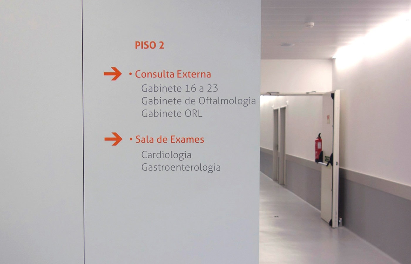
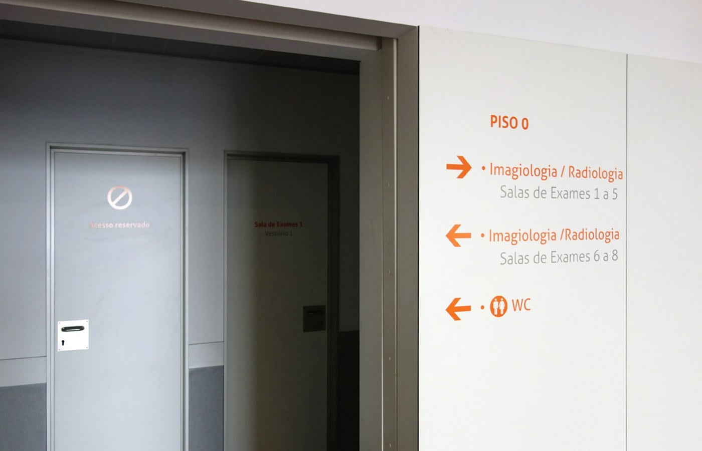
Branding | Design | Signage | Stationery
