Play this video:
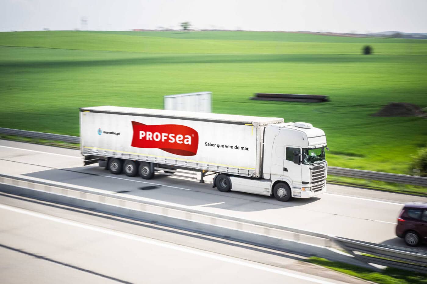
Profsea
Branding for frozen fish factory.
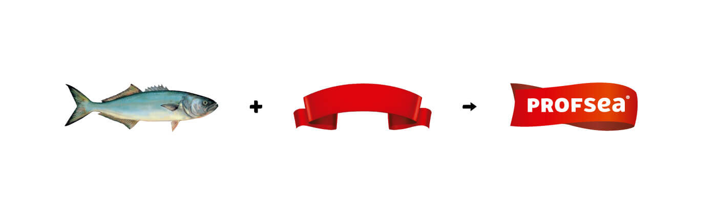
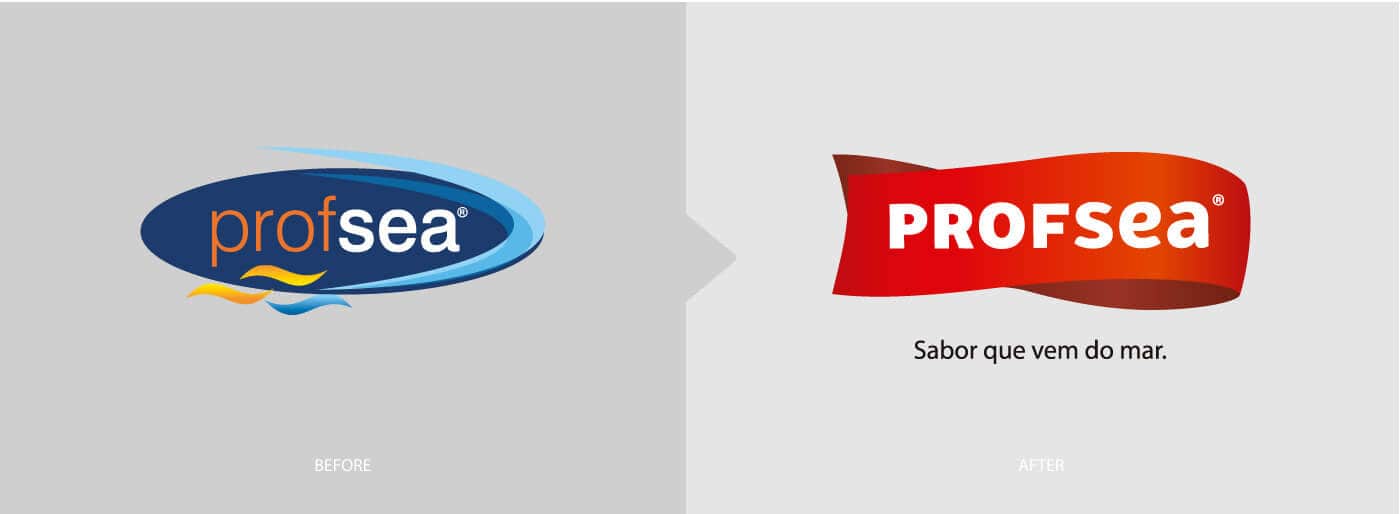
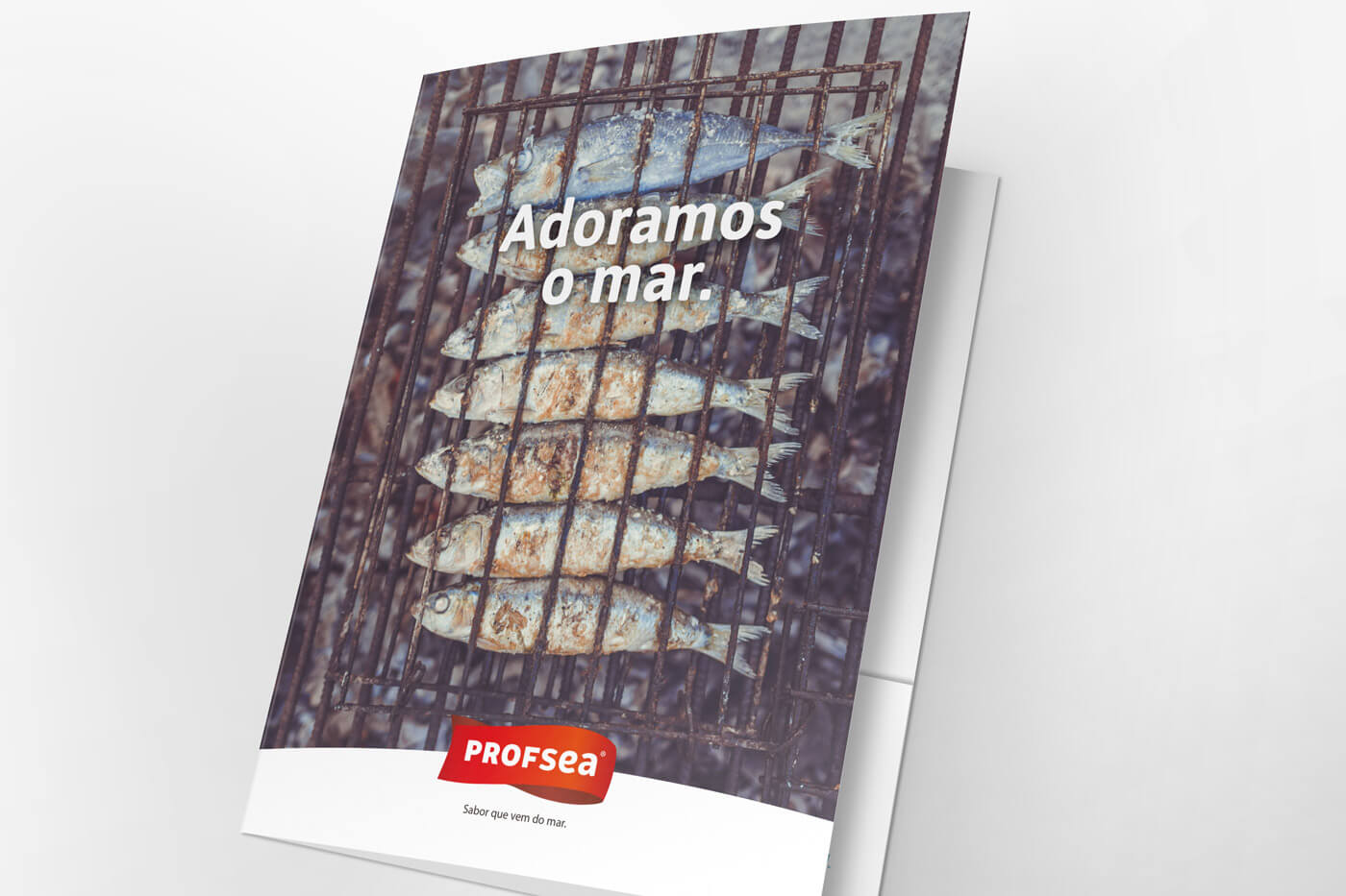
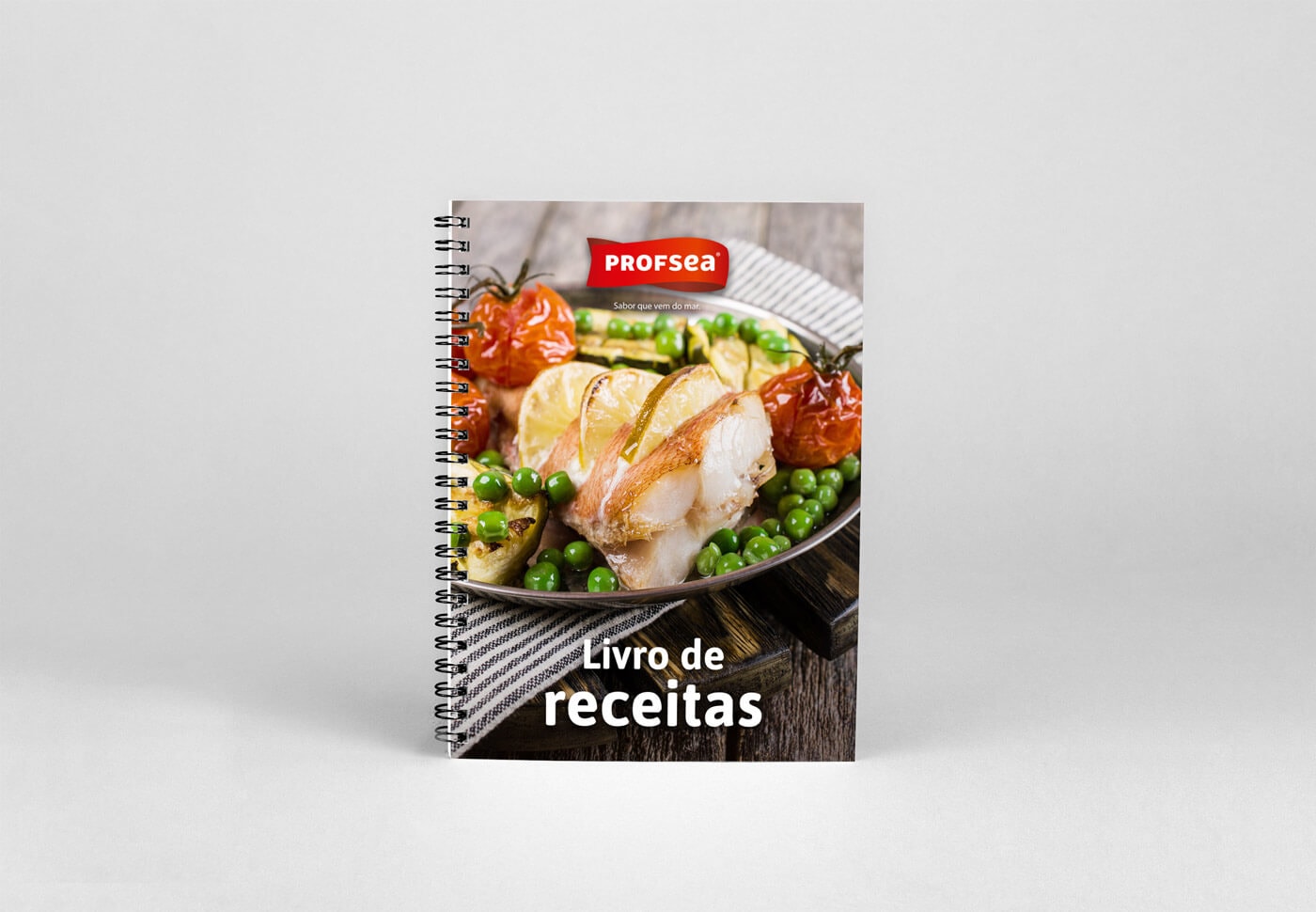
Profsea sells multiple frozen & ultrafozen fish products and was looking to rebrand itself with a more appetising look that would appeal to its direct consumer. The main goal was to bring together the frozen product with the flavorful cooked meal it could become.
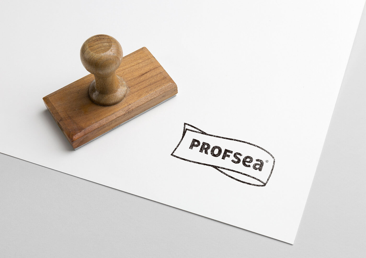
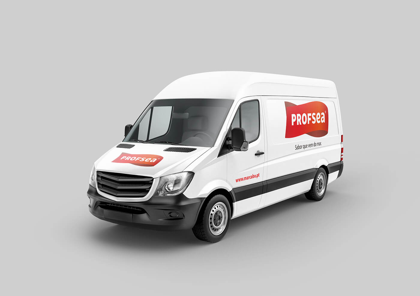
For their rebranding we used the iconography of a fish and a banner together, and opted for a bright, warm red as the main colour. This was due to red being commonly associated with food and offering a great contrast with the colder blue tones typically found in the packaging of frozen products.
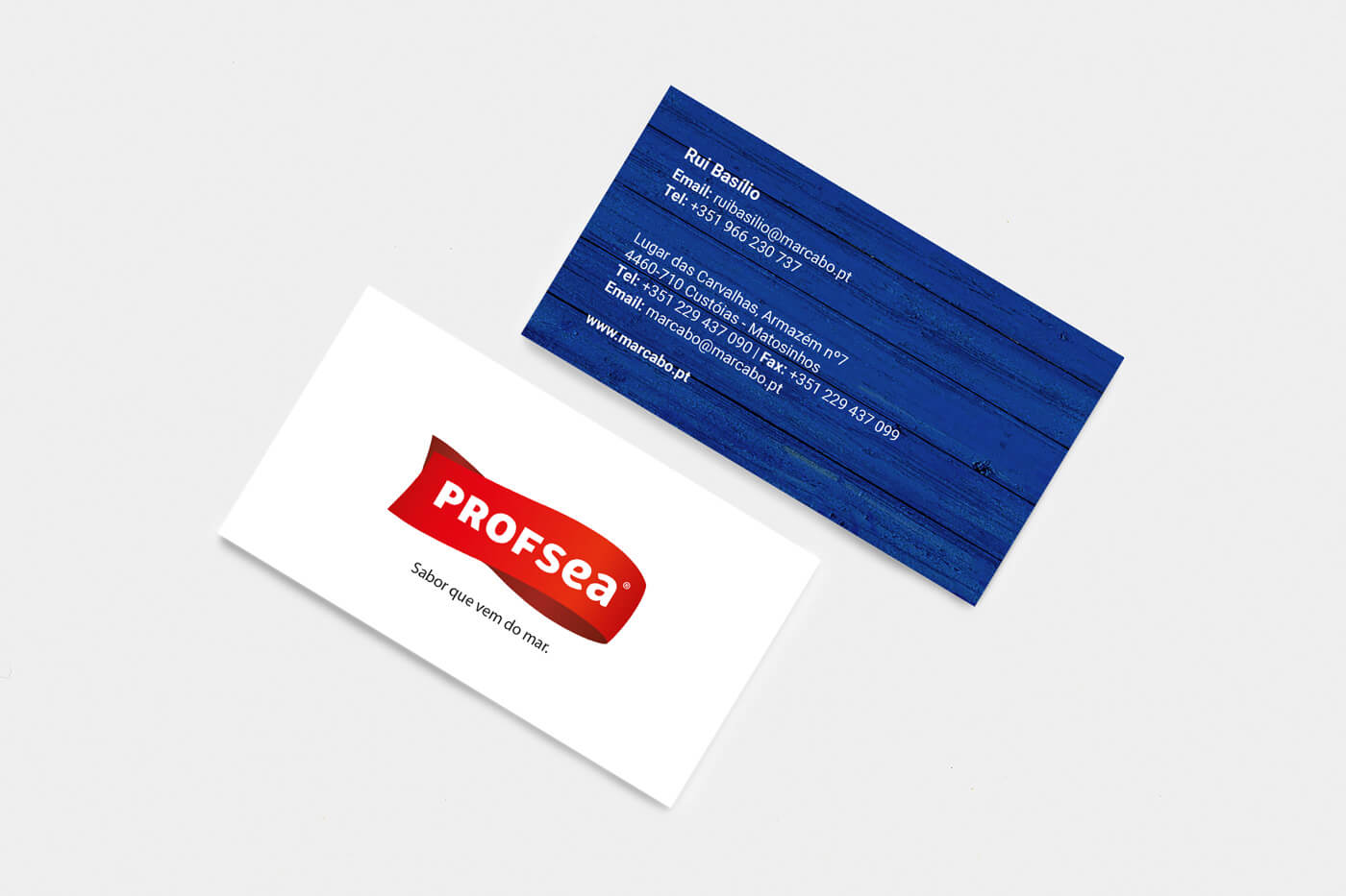
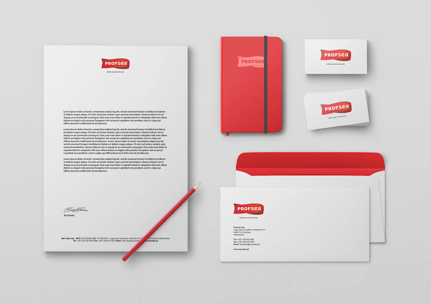
Strategy | Branding | Stationery | Marketing Materials