Soares & Carrulo
Topography.
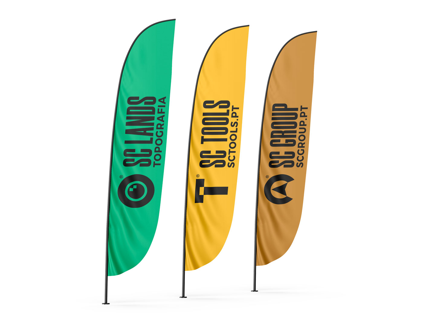
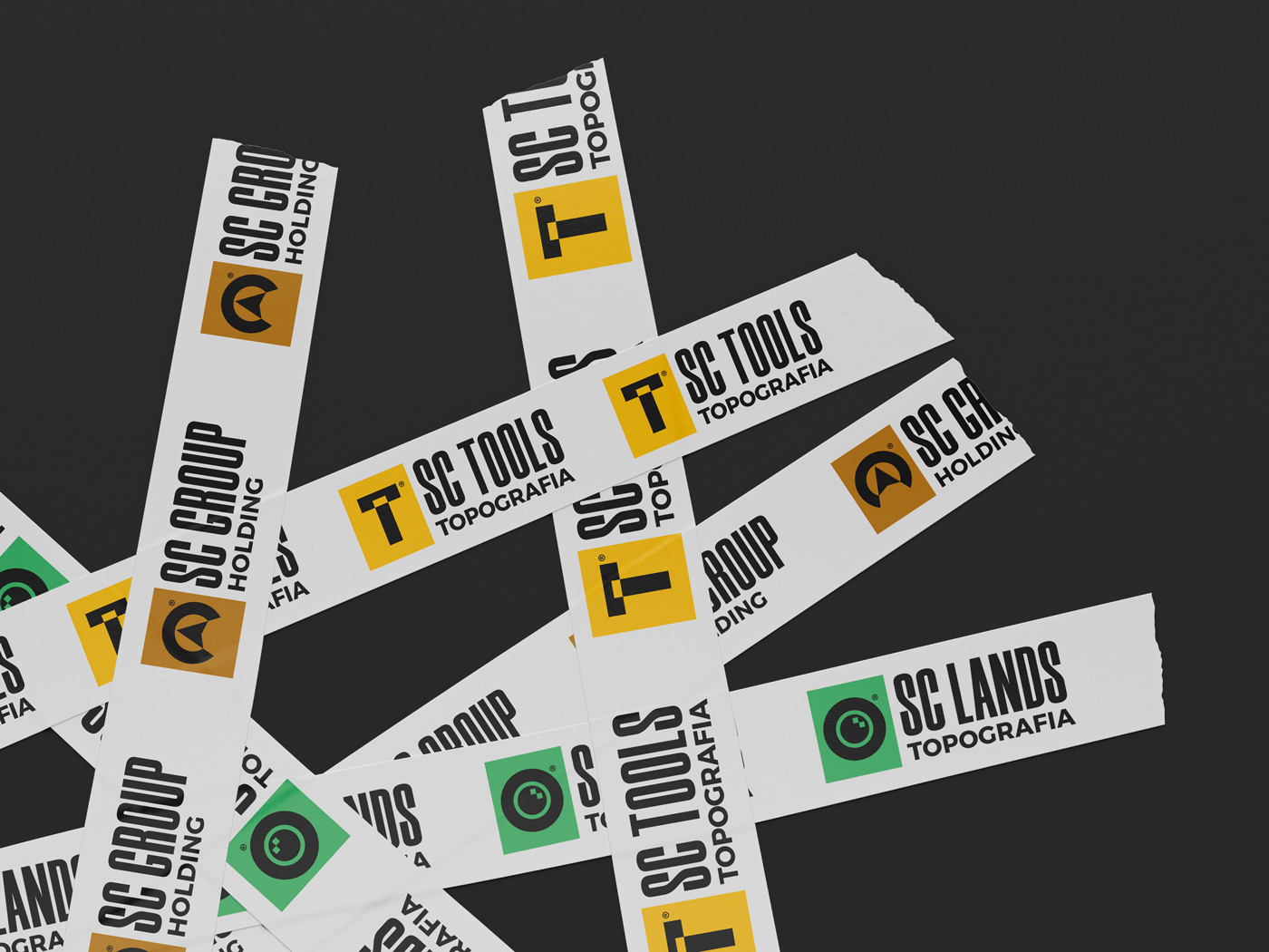
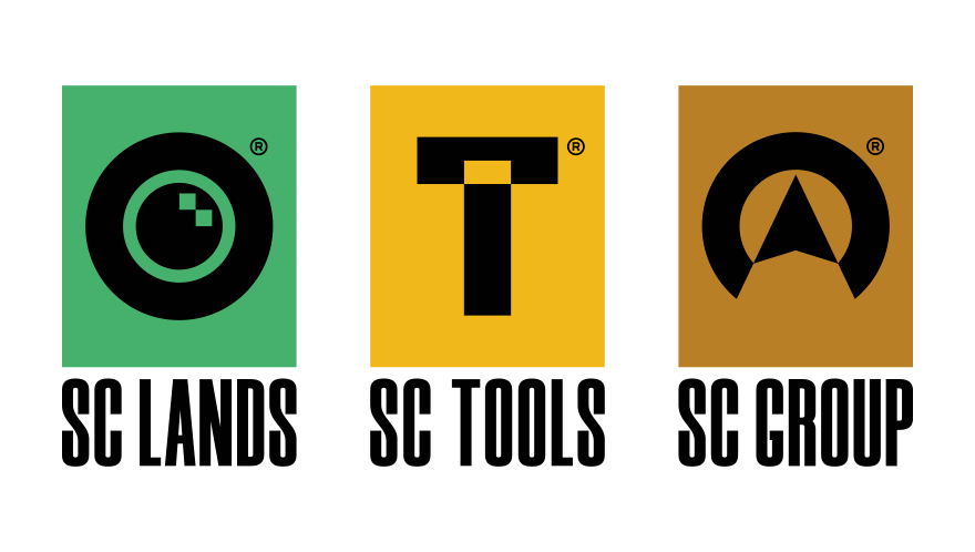
Soares & Carrulo is a company that handles topographic mapping. It’s split in three brands: SC Lands, SC Tools, and SC Group, for which we designed three logos.
The logos have a cohesive graphic identity, that makes each brand recognizable as a Soares & Carrulo company.
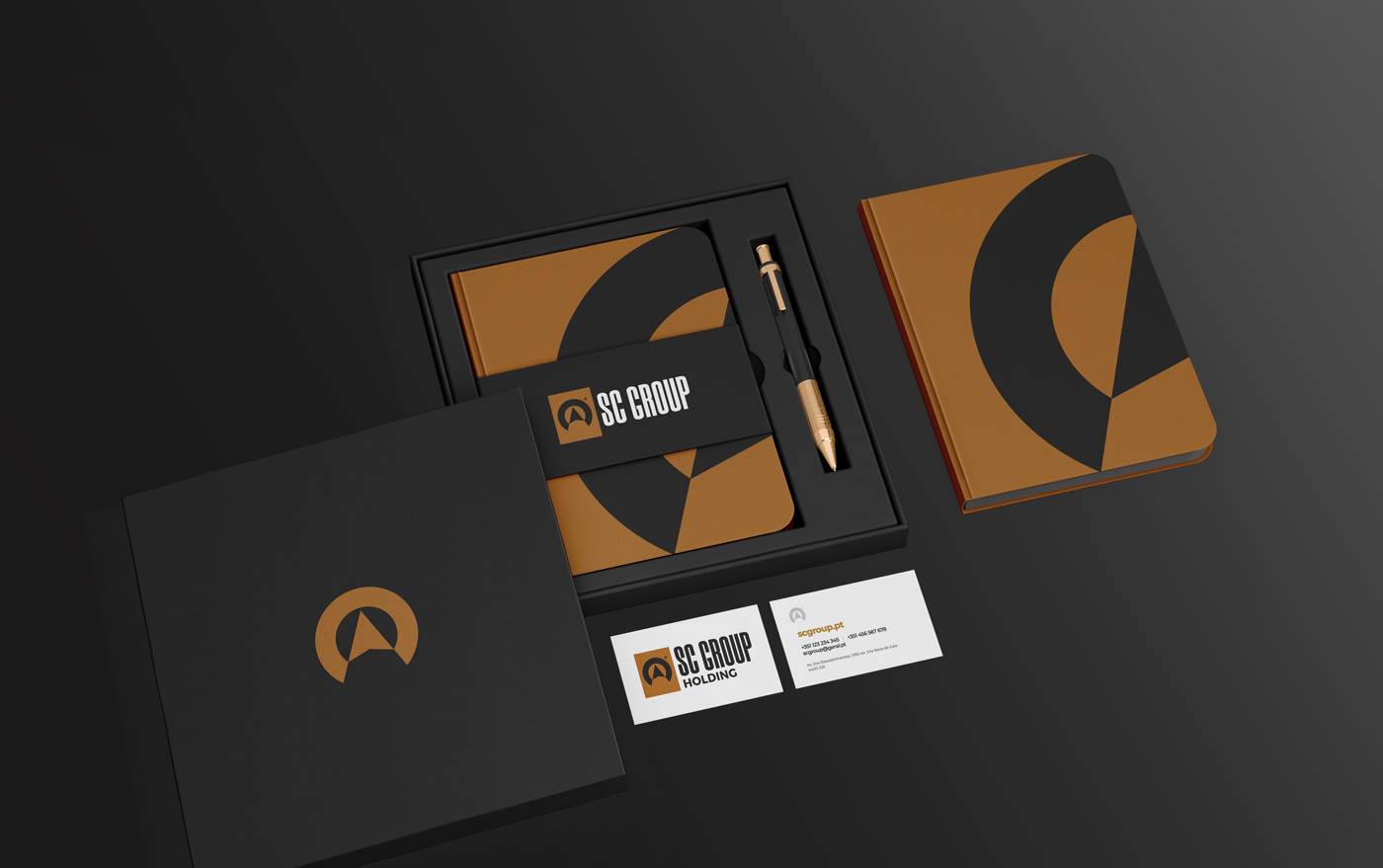
Branding | Stationery

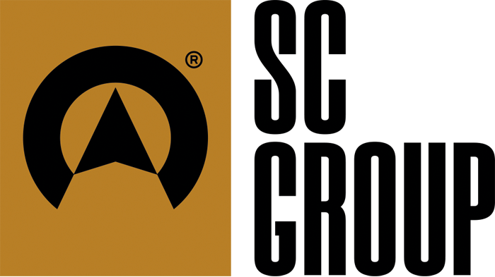
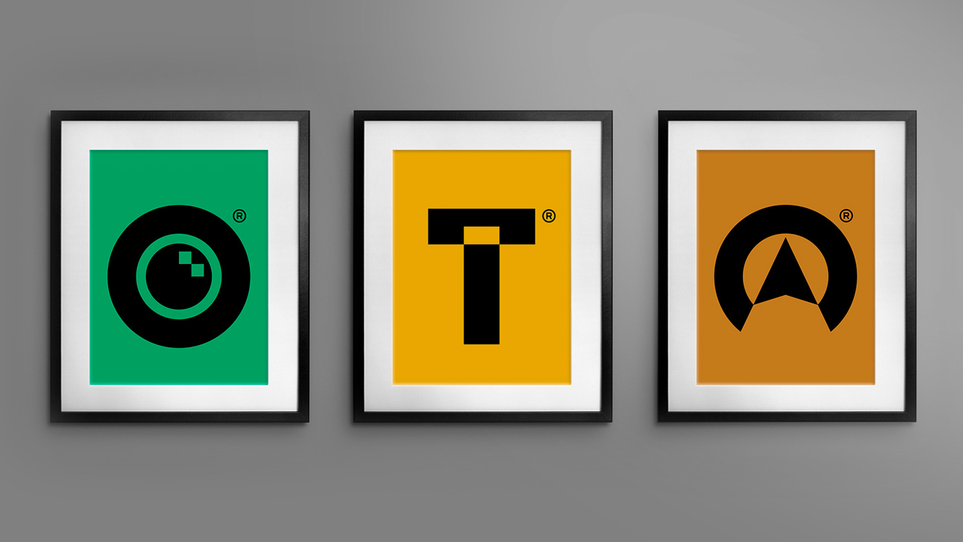
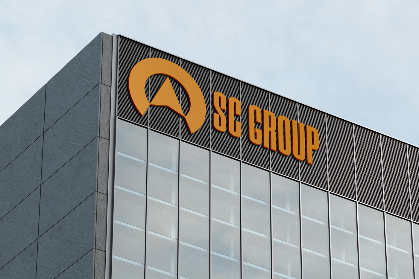
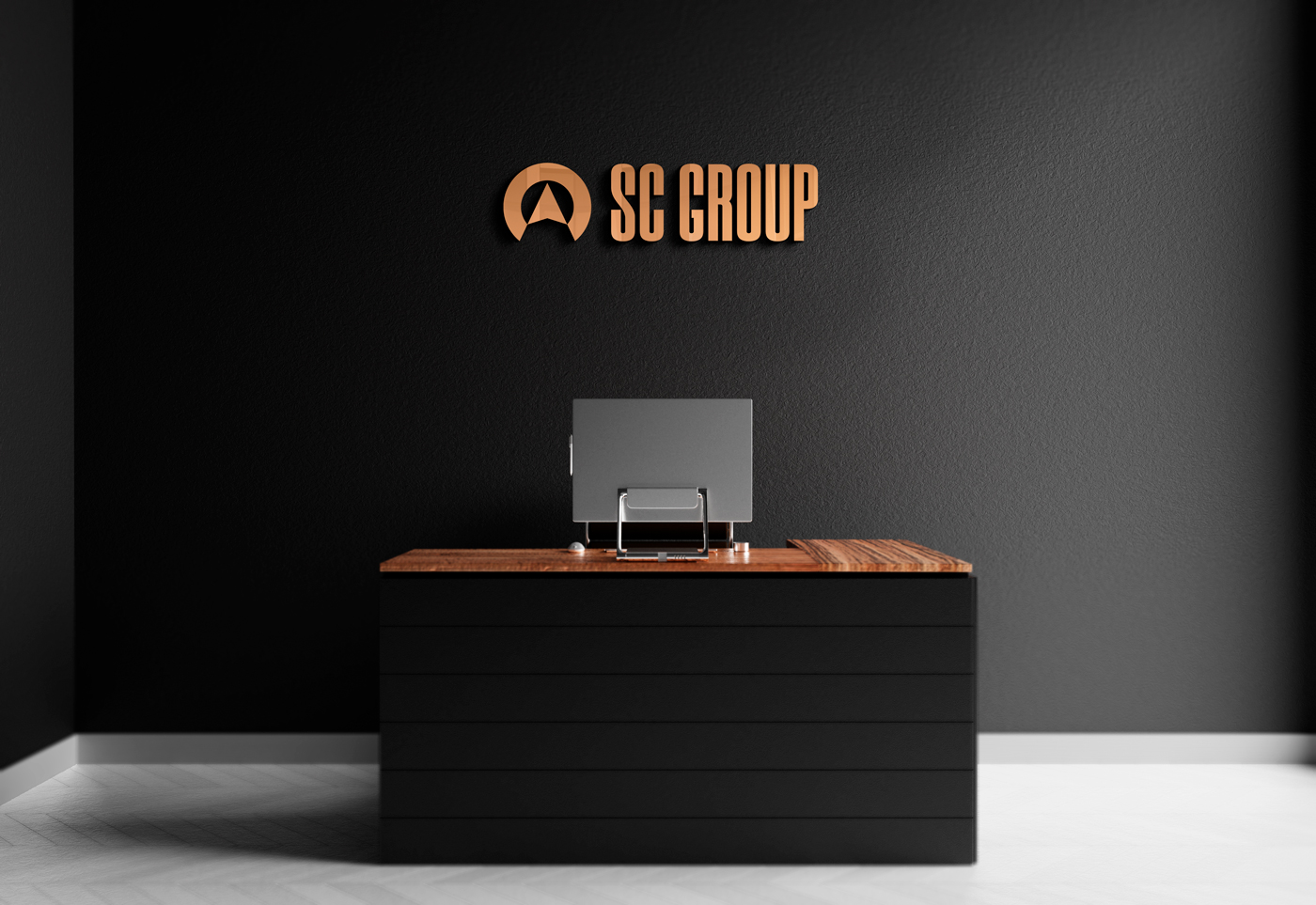
SC Group is the holding company that SC Lands and SC Tools belong to.
The concept of the logo therefore combined the imagery of a compass with a mountain. A mountain represents big heights, a summit peak, while the compass is a symbol of guidance, or leadership.
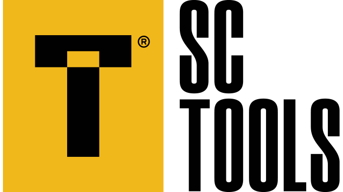
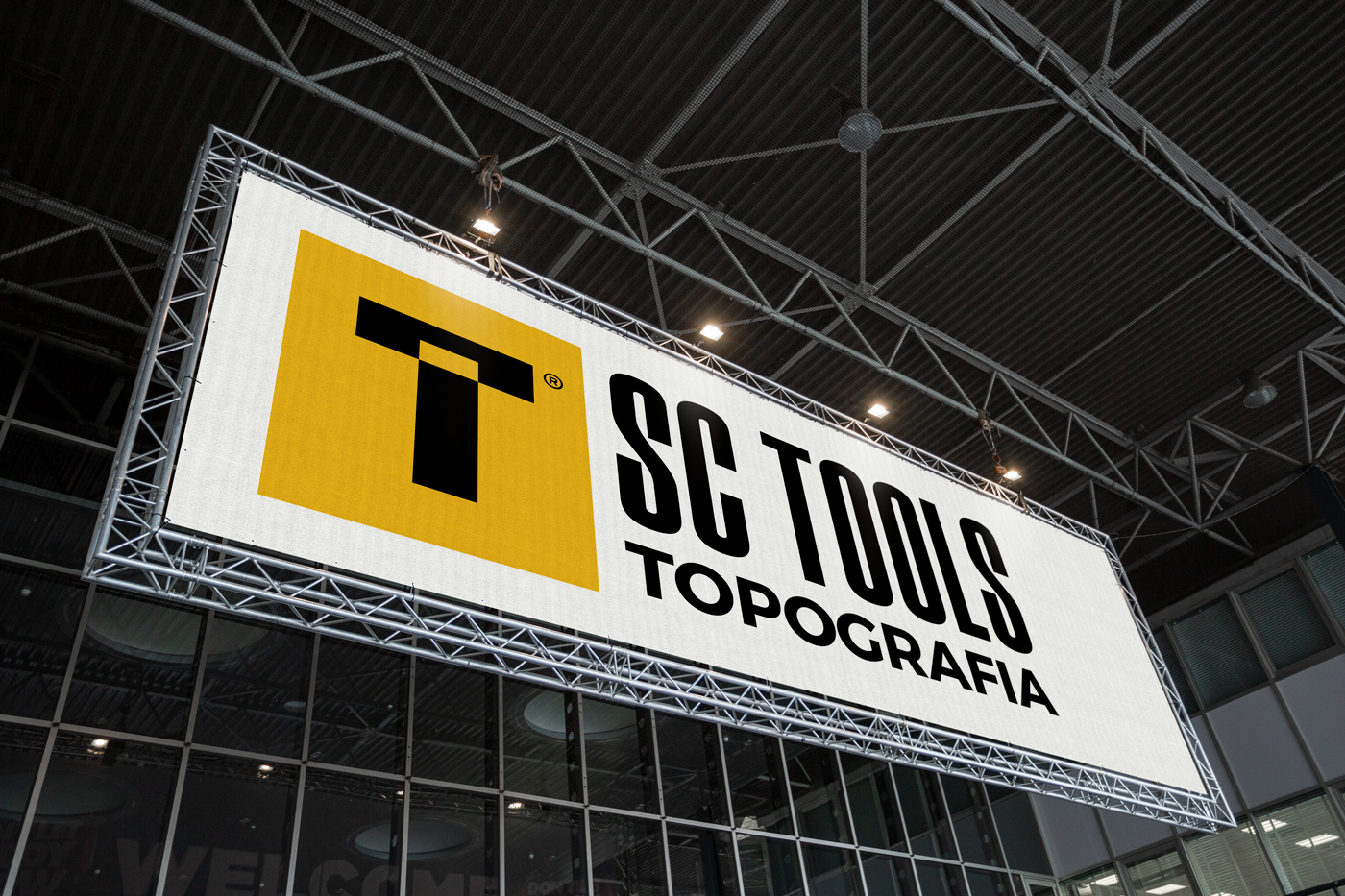
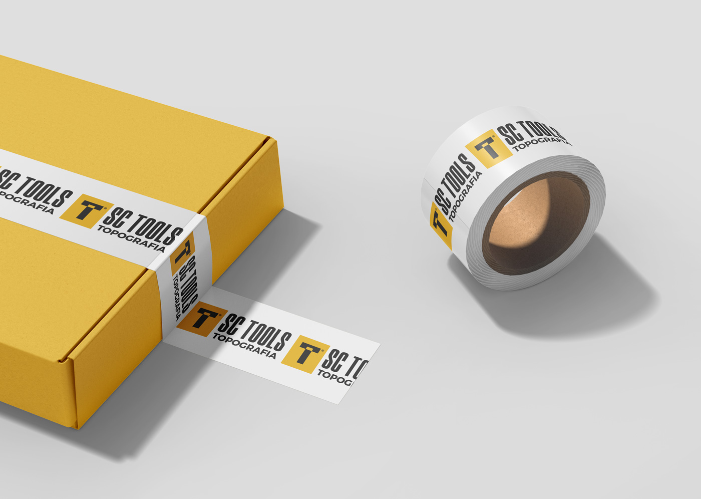
SC Tools handles the acquirement and sale of topographic tools.
With that in mind, the logo design combined the letter T of tools with the T-shape of a topographic ruler.

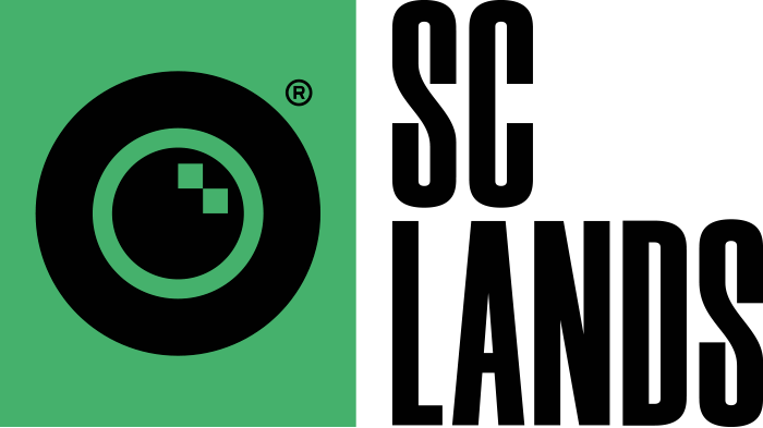
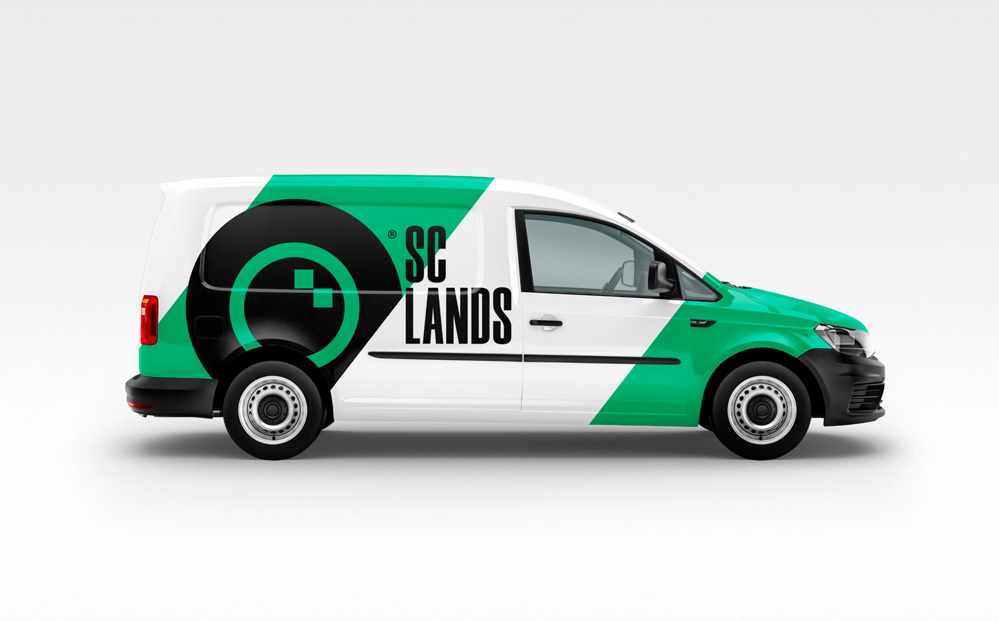
SC Lands handles in field topographic readings. This is the company that will collect data from a future construction location and ensure everything is ready.
The logo took inspiration form a topographic measurement tool, distinguishable for its round lens. It’s that very lens that became. asymbol of SC Lands’ identity.
