Font Matters
Does it look the way you’re saying it?
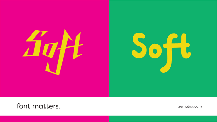
Even something that may seem inconsequential, like a font choice, makes a big impact in your design.
Look at shampoo bottles for men and women, for example. The label typographies are completely different for the same brand. For masculine products, squarer and more angular shapes tend to be used, whereas female products opt for the levity of curves and soft colours.
This is because different shapes lead us to different associations. When we want to convey something soft, it doesn’t make sense to use a font that’s sharp and filled with cutting edges. We associate softness with smoothness, with rounder typographies and a lighter overall look.
We all enjoy consistency, and we all have a visual language that is universal and easy to work around. Often it’s best to avoid a design that is contradictory to the product’s characteristics.
Through a font you can say a lot about a product. Is it elegant and thin or bold and impactful? Is it modern, classic or vintage? Does it transmit a sensation, a texture, a feeling, or is its goal to be neutral and professional? These sensations are programmed into us in an almost instinctive manner, leading us to different impressions of a brand or product – impressions that, more often than we would imagine, turn out to be fairly accurate.
Be logical in your design options. By staying true to the nature of what you’re trying to sell, you are helping make it clearer and more accessible to your consumer.
Say hello and find out what can we do for your business. Write us an email to: info@67.pt.
