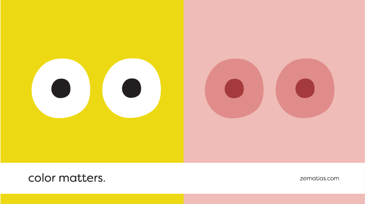
Color Matters

By changing the colors, you can change the meaning.
It’s incredible what can be achieved in communication, using colors. Colors awaken feelings and memories in our mind and establish connections with experiences we know. It’s up to whoever designs communication to know how to use it in their advantage, provoking in the consumer the reactions they want. Sometimes it might seem like a color was picked randomly, but that’s rarely the case. Colors, just like all other elements of a logotype, for example, are carefully chosen, to produce the desired interpretation.
Blue, for example, is often used to convey trust by more conservative brands. It’s also an addictive color, and we can find many examples of it in multiple social media where we spend hours every week (facebook, twitter, linkedin, tumblr, etc).
On the other hand, red is stimulating and passionate. It creates a sense of urgency, making it a popular color for sales. It also encourages appetite, making it a popular go-to color for fast food joints like McDonalds, Pizza Hut, KFC, etc.
Greens are healthy and environmentally friendly, harmonious and organic. Blacks are authoritarian, strong and elegant. Yellows are cheerful and impulsive, and whites are clean and modern.
Knowing color theory, or even just being aware of the sensations different colors produce in us, we can use it in our favour.
But watch out: color can have different meanings in different places, and before you use it, you should be aware of it. For example, in China, green tends to have more negative connotations than good ones.
Brands do so to explain themselves more efficiently… and consumers appreciate the clarity of the communication.
Without misunderstandings, everyone wins.
Say hello and find out what can we do for your business. Write us an email to: info@67.pt.
