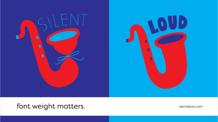
Font Weight Matters

When it comes to capturing attention, big beats small.
We already wrote about the relevance of the font type for image perception, but we’d like to reinforce that the weight chosen (bold, regular, light) is just as important.
Defining hierarchy
Instinctively, we read larger and fatter (bold) letters first and then the thinnest ones (regular and light). Having that in mind, we can design the way we present text to guarantee that what you read first is the most important part of the message.
Highlighting a text
The bigger the letter’s weight, the more it “pops out”. We can use “bold” in some words or sentences that are more important to make them stand out.
When we see lighter fonts being used, we assume they function as side-notes to the main text. This is a simple way of writing optional information while giving a big cue to the reader to stay focused on the main (standard weight) text.
Why it matters
We can’t lie to ourselves: it takes a certain amount of effort to look at a homogenous wall of text and read it all with attention. This is why font weight is important: as small as it may seem, it makes a very big difference in letting the readers know what they need to pay attention in the first place.
We may not be able to retain everything a paragraph is telling us, but if a phrase is bolded, we will know that’s a key idea we should look out for.
So, make your reader’s work easier! Write in a way that’ll let them understand a text even if they just skim through it.
In design everything is thought out to the smallest detail, even if at first glance it doesn’t seem that way. ?
