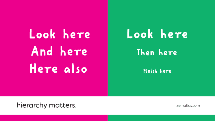
Hierarchy Matters

First things first.
When telling a story, it’s important to have a beginning, a middle and an ending. We need the guiding, the buildup. We need to know where to look first and what to follow up with.
In design, we can do this through hierarchy.
When you want to capture the attention of a potential client, you have to take into consideration that they don’t have much of it to afford you in the first place. People are busy, after all, and there aren’t enough hours in the day to retain everything that is floating out there.
This is why an order of importance needs to be defined. The focal point of your marketing strategy has to come first. It has to be loud and clear and eye-catching at first glance. That’s how you’ll capture your client’s attention.
Direct their attention in an understandable and easy to absorb way.
If you put a wall of content in front of them with equal proportions, you are demanding too much effort to read. It’s a real obstacle. This will be read in a book, but not on a poster.
Instead, offer them bite sized information, quick to absorb so that they could “eat it” one bite at a time. Also, make sure the first bite is the best. If they like the first one they’re more likely to eat the second piece… and you know where this is going…
Techniques like using bold and large fonts for titles work just fine to provide your content with desired hierarchy.
Say hello and find out what can we do for your business. Write us an email to: info@67.pt.
