by administra | Dec 10, 2019 | Design Matters
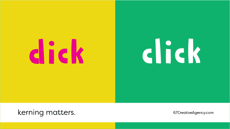
Kerning Matters Letters need space to breathe too, you know? “Kerning” is the technical term to refer to the space that exists between the letters of a typeface (the type of letter). Designers can edit this spacing to create different styles and sensations. And, of...
by administra | Nov 29, 2019 | Design Matters
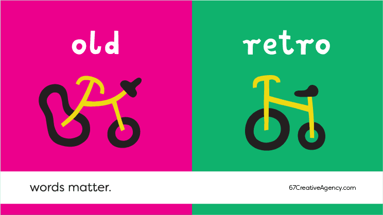
Words Matter You say the wrong word… and you’re done! The haute couture of advertising is found in texts that are carefully magnetized with words that attract to the message all kinds of beneficial secondary associations. The synonym dictionary can be a great partner...
by administra | Nov 26, 2019 | Design Matters
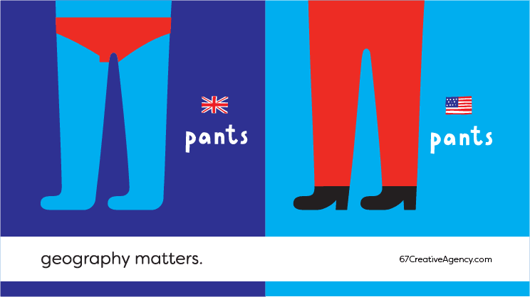
Geography Matters Don’t say the right thing, at the wrong place. Everyone knows that you ask for a “pop” in the north and a “coke” in the south [of USA]. Not knowing this information can be fatal to an advertising campaign done in the United States that’s trying to...
by administra | Sep 18, 2019 | Design Matters, Insights
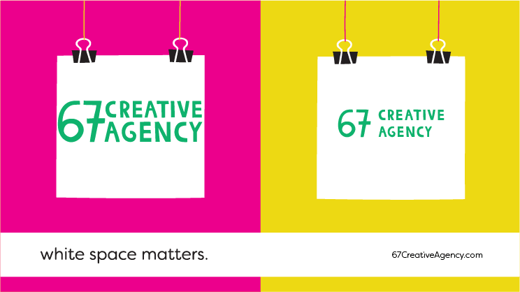
White Space Matters Is white space important? Yes, let it breathe! Nobody likes getting in a crowded subway. There’s always the risk of having someone’s elbow painfully pressed against your stomach or a stranger’s breadth too close to your neck. Maybe in a less...
by administra | Aug 9, 2019 | Design Matters, Insights
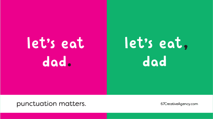
Punctuation Matters Communication Design isn’t just “figurines”. Text is a fundamental part of the message you want to transmit. It’s your message’s soul. Punctuation is a part of it and you should pay attention to it. That is why it matters. When I was in...
by administra | Aug 8, 2019 | Design Matters, Insights
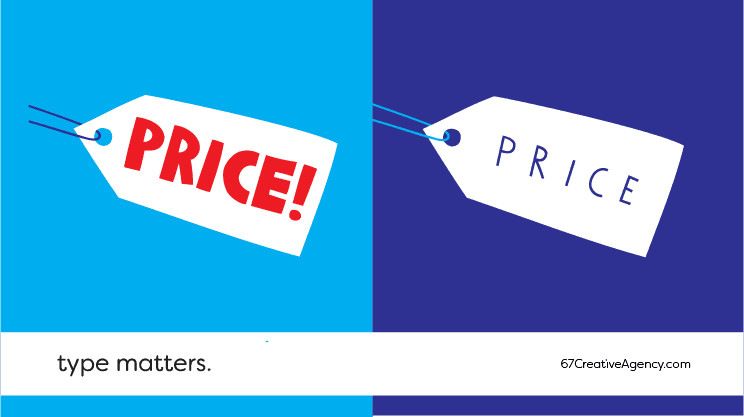
Type Matters The typeface defines words meaning. Before you read the rest of this article, TRY THIS EXERCISE: Identify in the image above which is the cheapest and which one has the highest price. If you are European or American you probably picked the “FAT”...
